Project Overview
The CW application offers users access to watch free, full episodes of all their favorite CW shows and is available on iOS and Android devices. CBS/Warner Brothers tasked Phunware with launching a 2.0 version of the app which would refresh the UX and UI.
After being one of the two designers on the original 1.0 version a few years prior, I was assigned as the lead UX designer for this 2.0 version release. In my role, I was responsible for creating the wireframes for iPad and Android tablet as well as developing the visual design that would be applied across all devices. In addition to the creative director, another creative team member was assigned to the project to handle translating my new designs over to phone versions of the app for iOS and Android.
Quick App Map Edit
The first step in the redesign was redoing the application map. This was a fairly quick task. Changes made included removing a few lightly used features and moving one other feature into the main navigation. The features being removed were based on usage data CBS/Warner Brothers had collected over the lifespan of the existing application. The original app map was pretty straightforward and the product owners were pretty satisfied with how it was structured, so changes were minimal.
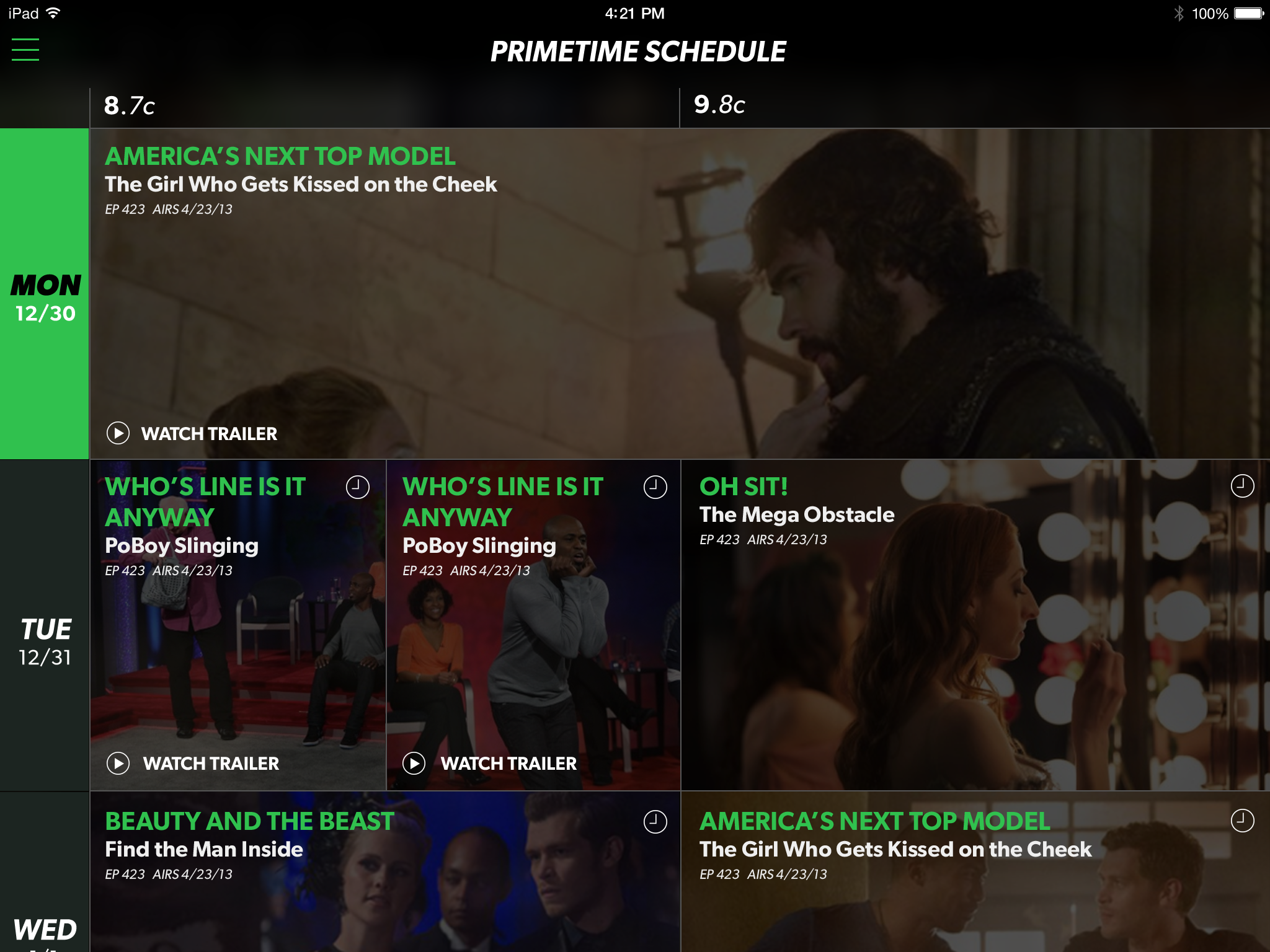
Wireframing
I then moved on to creating a new wireframe for the application. First I created a key concept document that fleshed out the UX changes that I wanted to make to the app. In addition to those changes, I applied my visual design proposal to the screens. This saved some review time and was easy to do since there weren't too many unique screens to the app. I then created the full wireframe after approval was given from the CBS/WB team. The following are some of the major changes that I made.
New Navigation
The first area I looked at redoing was the navigation bar / banner area that lived across the top of each screen in the app. Changes to this area included reducing the CW logo size, removing the banner image, eliminating the navigation bar, and creating a navigation drawer housing menu items for Home, Shows, Schedule and Settings. This consolidated the navigation items into one easily accessed point and freed up a lot of space at the top of the screen, giving the app a much more open feel.
Featured Carousel
Once I was done rebuilding the navigation, I focused on the home screen to see what improvements I could make there. I made several changes that continued to simplify the layout of the screen. First change was to the carousel. I increased its height and reduced the number of items shown from 3 to 1. The other two items in the carousel weren't being focused on anyway and having them there just took up space that instead could be used to better highlight each individual featured item.
Content Thumbnails
On the Show screen, the new space was used to display a bigger show image and highlight the latest episode.