


Project Overview
The Mobile Stock Alerts experience allows Schwab clients to create and manage various stock alerts from the Schwab app.
The objective of this project was to add this feature to the Schwab app and provide migrating TD Ameritrade clients with important capabilities. Prior to this launching, clients could only create stock alerts on their phone from a non-responsive page on Schwab.com.
My Role
Collaborated on the creation of product requirements
Created user flows and design mockups
Built prototypes for user testing
Discovery
Understanding the product scope
I kicked off this project with the product team by working through what the product scope would be for the stock alerts experience on the app.
High-level scope:
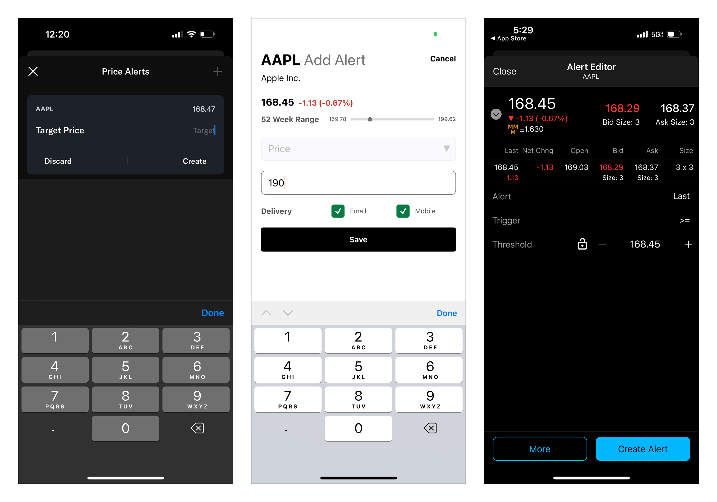
Users should be able to set stock alerts in-app only for the top four most frequently used alert categories on the existing web experience. The full set of stock alert categories will be added in subsequent iterations.
The alerts would only be delivered via mobile push
Users should be able to view and edit alerts they've set in-app
Users should be able to view in-app the alerts that have triggered
Creating Comparative Study
Next, screenshots of stock alert experiences from a few investing-focused apps were collected. The flows involved in this experience were not complex, but we wanted to see what similar patterns might appear.
Yahoo Finance • Seeking Alpha • TD Ameritrade Thinkorswim
Common patterns:
The alert configuration interface is presented in a modal over the screen the experience is launched from, allowing users to focus on the task without losing track of their previous context.
The symbol and current price is displayed somewhere at the top of the modal to keep users in context while they set the alert
The alert creation flow can be launched from the symbol quote screen
Once the alert has been created it appears on an open alerts list
Open alerts are grouped by symbol, not by time created
Open alerts are editable until they trigger
Alerts are created once at a time
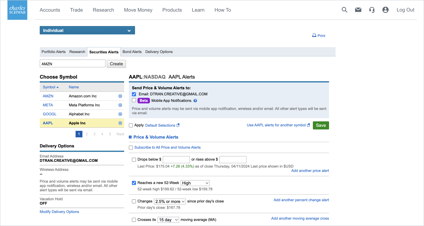
Reviewing existing experience on schwab’s website
We also reviewed the current Schwab.com experience to document the entry points and input fields that we would need to carry over to the app.
Design Execution
User Flows
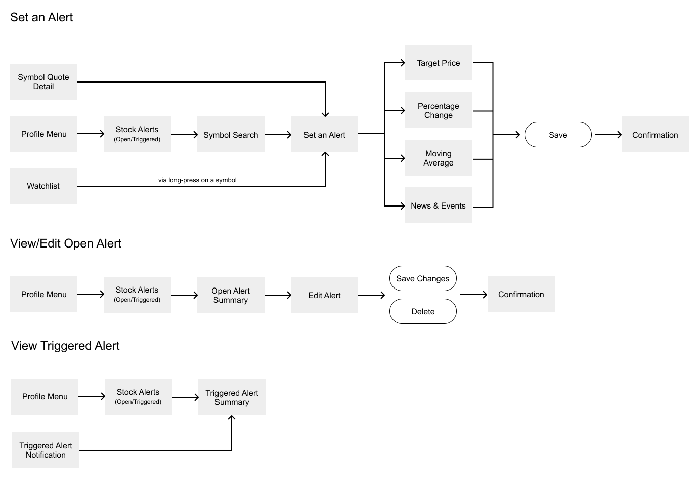
A user flow was created based on what we gathered from the Schwab.com alert flow.
The entry points into the experience would mirror what was on web.
Symbol Quote → Set an Alert
Symbol Watchlist → Set an Alert
Profile Menu → Stock Alerts (Open/Triggered)
Within the experience, there would be three main tasks.
Set an Alert
View/Edit an Open Alert
View Triggered Alert
Wireframes & Design Comps
Working collaboratively with the content strategist, wireframes and polished mockups were created initially in Sketch and then transitioned to Figma once Schwab's UX org adopted the tool while this project was in-progress. Once a general layout was established for each of the unique screens in the flow, the content strategist took that template and began delivering copy directly in Figma in wireframe format for me to take and apply to fleshed out mockups using iOS and Android components from Schwab's Everest Design System. The Ditto plug-in was used to build and manage a library of reusable text components within the file, allowing for quicker distribution of iterative text changes as we built out the screens.
UX Decisions
Open & Triggered Alerts
On the existing web interface, users lack a way to view their active alerts all in one place. They need to select a symbol and view a preferences-style list that includes both active and inactive alerts for that symbol. For the app, we created a separate Open Alerts list that would display all active alerts, organized alphabetically by symbol.
Triggered alerts had a similar issue. Users would need to select a symbol and view the triggered alerts for that specific symbol. For the app, a Triggered Alerts list displaying triggered alerts for all symbols in reverse chronological order is paired with Open Alerts in a segmented-control format.
Existing Web UI vs New App Experience
Format of Alert Configuration
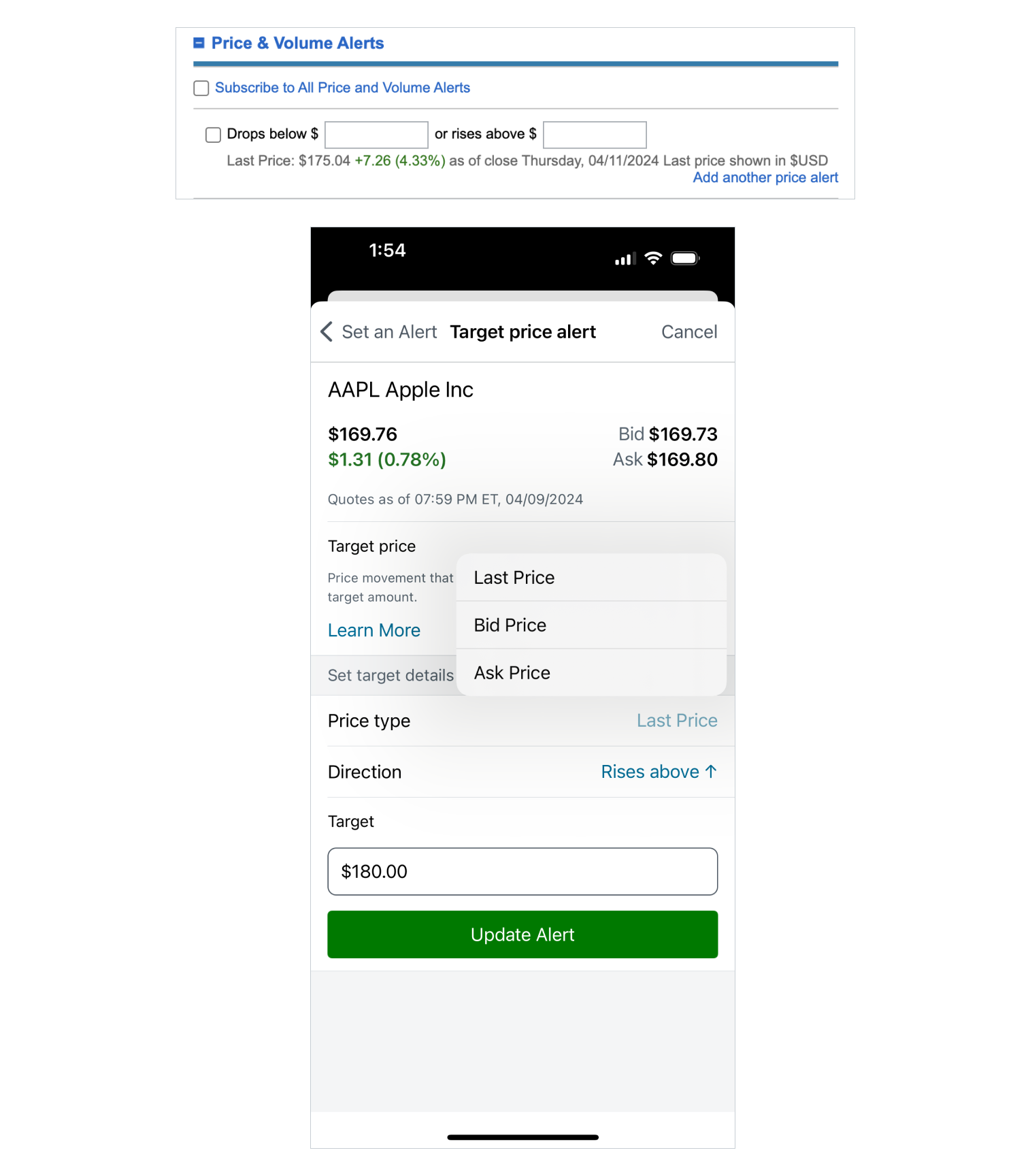
On the existing web interface, the alert fields are presented in a natural language/mad-libs style structure. Users fill in the blanks to complete a sentence. For the app, we abandoned this pattern for a more traditional form structure that creates an experience more familiar and in alignment with how users select/input values elsewhere on the website and the app. It also works better with the available component's in Schwab's Everest Design System.
User Education
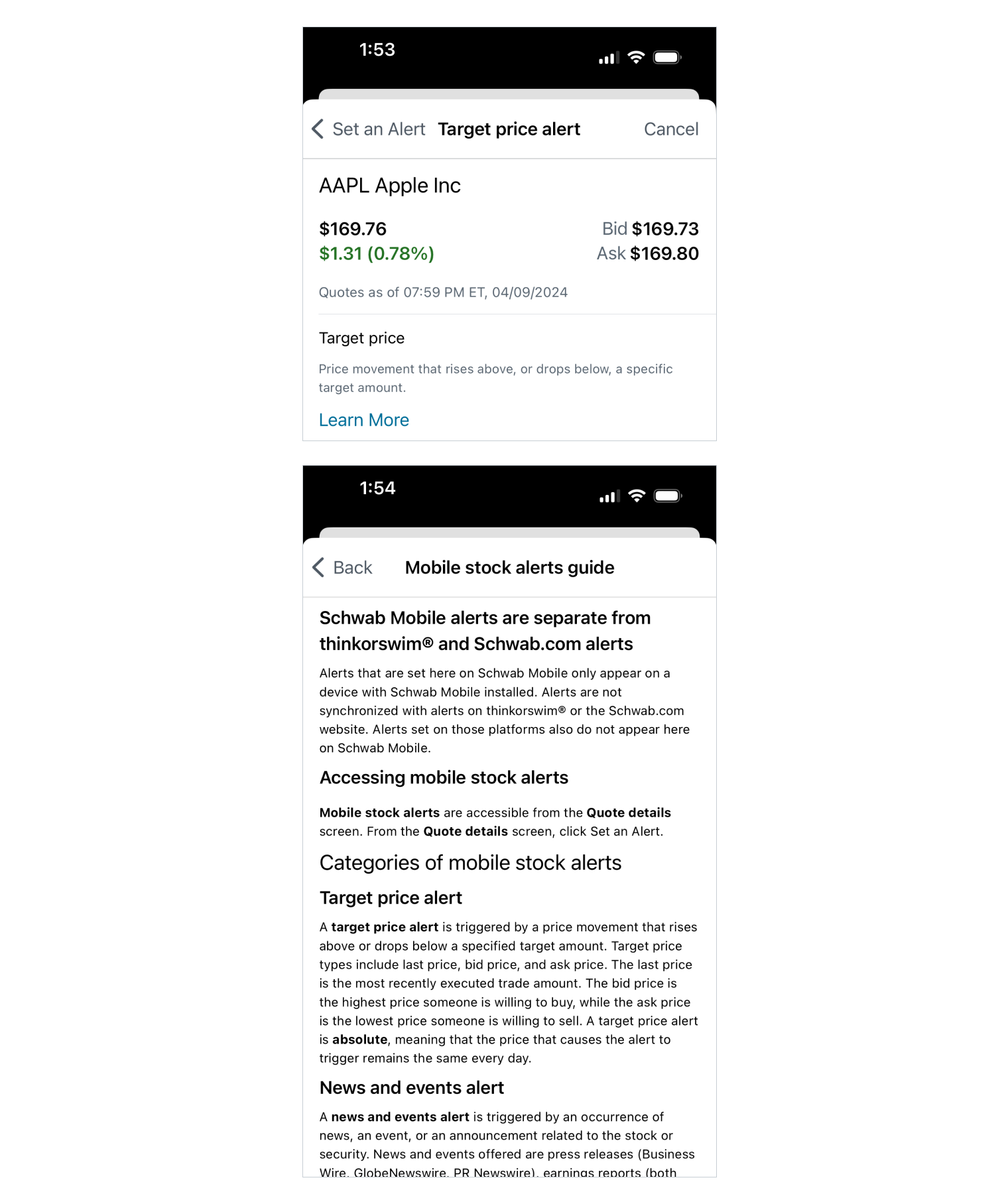
On the existing web interface, there are no definitions accompanying the different alert types offered, so users need to be knowledgeable about the alerts coming in. If not, they can easily search for definitions in a new tab on their web browser. For the app experience, it's a little more trouble to have to switch from the app to a browser or some other source to find that information. We've made it a bit easier on the user by providing definitions within each alert types flow. Tapping on "Learn more" opens a guide screen that goes into further detail on all the stock alert types.
Testing the Designs
Exploratory click tests were conducted by the UX researcher to assess efficacy of content and key interaction touch points in the Mobile Stock Alerts flow within the existing information architecture with a targeted respondent segment. Respondents found the flow straightforward and no significant changes resulted from the tests.
Outcome
With multiple rounds of usability testing validating the design concepts, confidence was high before launching. The feature went live on the Schwab app in mid-2023 and achieved the following:
Delivered important capabilities that migrating clients needed and provided a solid foundation on which to expand the offering in the future
Met usage goals set by the business and continues to increase
Increase of 44K unique users in a 6-month span
Increase of 260K landing screen views in a 6-month span
Average time spent of 2 minutes per alert creation
User Experience Team
Dan Tran - UX Designer
Larry Perera - UX Content Strategist
Christopher Wadham-Lynn - UX Researcher