


Project Overview
The Account Access feature lets Schwab clients provide access to authorized individuals so they can view account activity, trade, or trade and move money and assets. Prior to going live on Schwab.com, managing account access involved downloading or printing out application forms, filling them out, and then delivering them in-person, by mail, or via upload through Schwab.com's message center feature.
The goal of this project was to reduce client friction during the account access application and management process by creating an all-digital experience for the workflow.
My Role
Took part in planning and facilitating journey-mapping workshop
Collaborated on the creation of product requirements
Created user flows and design mockups
Built prototypes for user testing
Discovery
Workshop
Working alongside two other UX colleagues, I planned and facilitated a 2-day discovery workshop with Product, UX, Dev, and account access SME participants spread across three time zones utilizing MURAL, WebEx, and Skype.
Activities included:
Empathy mapping for the client and branch rep
Creating an as-is journey map to understand how the entire process currently works and the parties involved
Storyboarding several common scenarios from the key users' prospectives
Key Users & Access Tiers
Based on information gathered during the workshop and follow-up conversations, we identified key users and access tiers our work would touch.
Key users:
Individual Account Holders
Joint Tenant Account Holders
Agent (Individual Being Added)
Access Tiers:
View-only Access
Limited Trading Authority
Full Trading Authority
Existing Forms & Communications
The team reviewed existing forms and communications that appear throughout the workflow. These include application forms for each individual involved and various emails they receive during the process. We identified and documented required content from these items to include in the digital workflow.
Product Requirements
Working with the product owner, UX researcher, content strategist, and development team, the requirements that had been gathered during our discovery were turned into UX epics/stories using Confluence and JIRA.
Design Execution
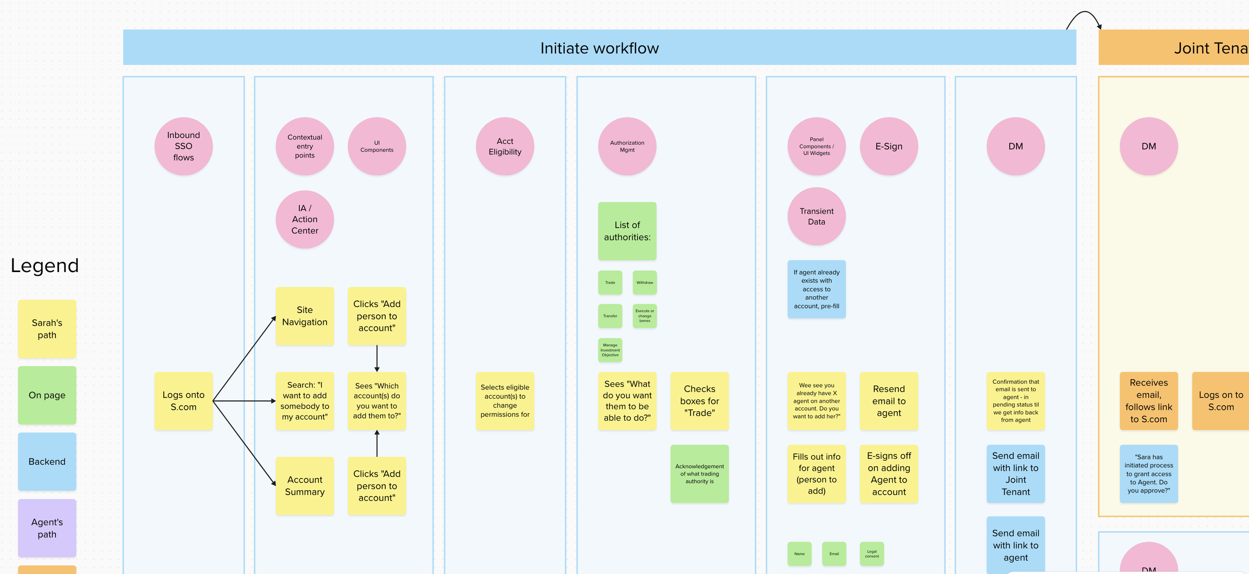
User Flows
The preliminary user flows that came out of the discovery workshop were continually refined as we worked through the product requirements and consulted with various SMEs. Once the flows reached a “final” state we all agreed on, the project was able to move forward with comps.
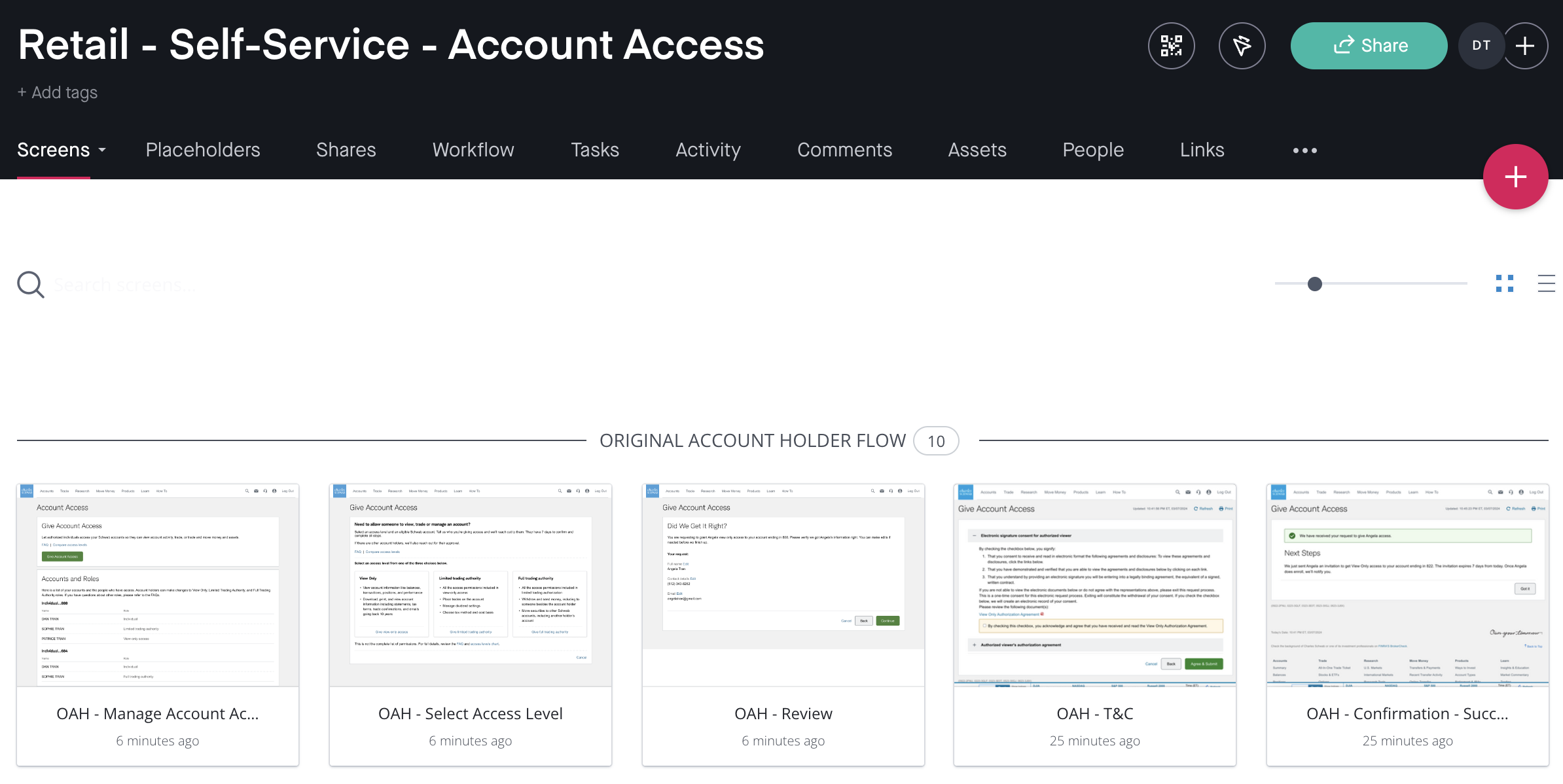
Design Comps & Prototypes
Design comps were created in Sketch and uploaded to InVision to organize and build working prototypes. Visual design was applied using Schwab’s Everest Design System components, expediting the time it took to mock up screens and minimizing visual design decisions.
Labeling the Workflow
The cross-functional team brainstormed a list of potential labels for the workflow. Our UX researcher presented this list in testing via UserZoom survey and questionnaire. The testing pool consisted of 10 active Schwab traders (logs in at least once monthly) and 56 general population. Testing included a stack ranking exercise, click test and contextualized scenarios. Overall, “Manage Account Access” and “Account Access” finished #1 and #2, with the active trader segment slightly preferring “Account Access”. The team decided to go with “Account Access” as the label.
Placing the Entry Point
Our team collaborated with the Global Navigation team to determine where in Schwab.com’s information architecture the entry point to the workflow would live. That team was in the process of doing an overhaul of Schwab.com’s navigation, so they were able to include our item in their unmoderated tree testing. Their test results revealed that a majority of users expected it to appear in the the Profile menu, which we had assumed would be the case.
Applying Self-Service & Form Design Best Practices
Once users enter the workflow, our goal was to create a low-friction experience that enabled users to self-serve successfully. To do that, we implemented several self-service and form design best practices.
Design for Simplicity & Clarity
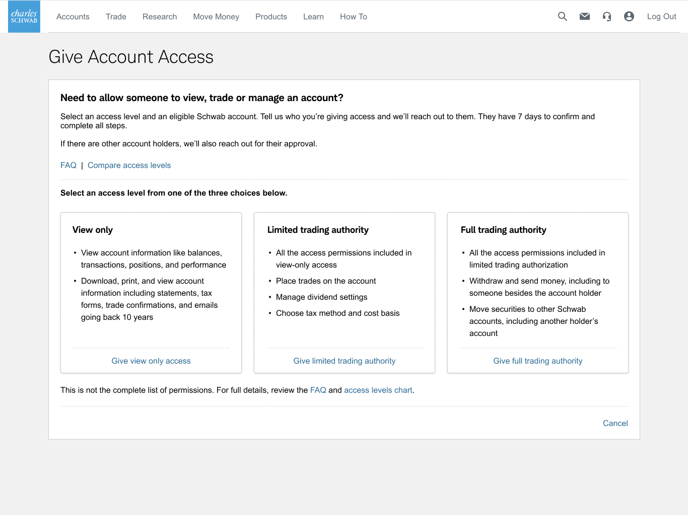
For account holder’s, the Account Access page isn’t something they will engage with frequently and when they do engage, it’s not a page they will linger on for too long. They are either there to start the process of giving someone access or they are there to manage existing account roles. We designed a utilitarian two-panel stacked layout that reflects the low-frequency relationship clients will have with this experience.
Most clients will interact with this page for the first or only time when giving account access, so that action is given priority in the layout as it appears in the first panel. We provide a short and concise description for the feature and pair it with the pages primary CTA.
The second panel displays existing roles on a client’s accounts. We organized roles by account and provide the client with removal and change actions for each individual.
Overall, a very minimal page, but it provides the actions and detail client’s will need to get their start in the workflow.
Provide knowledge base
Once an account owner initiates the Give Account Access flow, we supplement the key features listed for each access level in the selection interface with links to an FAQ and comparison chart with more comprehensive information about the capabilities of each level. This should provide users with all the knowledge they’ll need to begin the process without having to reach out to a representative.
Keep it short
To get the application process initiated as fast as possible, the account holder’s portion is kept fairly short. Once they’ve selected the access level they want to grant and the account they want it applied to, we limit the information we request from them to only what is necessary to contact and proceed with the agent.
Reduce cognitive load
After the account holder has completed their portion of the application, the agent must complete a much longer form. For their flow, the application is broken into a multi-page form to reduce the cognitive load of having to complete the 49 required and 5 optional inputs presented.
We divide the form into four main sections:
Profile Information
Regulatory
Trading Experience
Review & Finish
The inputs in each section are further partitioned based on logical groupings, resulting in three pages per section. A review section completes the flow at the end.
Additional cognitive load reduction is facilitated by sticking to an easy-to-scan, single-column layout. Exceptions exist in certain cases where related fields were placed in-line (e.g., first name, last name).
Order inputs from easiest to hardest
Profile information is placed first in the agent flow since we want them to quickly reach a point in the application where they feel compelled to finish before we present them with more daunting regulatory and trading experience questions.
Use saved data
Agents that are existing Schwab clients can accelerate the application process by logging in. Once they have done that, we fill in most of the Personal Information section with data we already have saved in their client profile.
Communicate progress to the user
Throughout the process we provide timely progress updates to both account holders and agents.
At the end of each user’s application, we provide the current status of the application and provide clear next steps.
Within the agent’s application, we utilize a progress tracker to give the user a rough idea how long the form is and where they currently are.

Outside of the main application experience, we provide progress updates at key moments using email and Schwab.com’s Message Center.
Testing the Designs
I built prototypes for each of the flows in InVision and provided them to the UX Researcher, who then conducted click-testing via UserZoom. The testing evaluated efficacy of interaction points, design effectiveness, and content.
With each of tests, the flows performed satisfactory. Recommendations that came out of them mostly concerned content, which was continually revised.
Outcome
Once testing was completed, the designs continued to go through internal reviews with our legal and compliance team, who needed to go through the content multiple times to confirm it didn’t put Schwab at legal risk. Towards the end of the project, I transitioned over to a different team, so design QA and any minor content changes were handled by another designer.
The feature went to production a few months later and subsequently enabled over 215K role-adds via the digital experience in the first year of launch, reducing all-paper submissions by over 70%.
User Experience Team
Susie Herbstritt - UX Manager
Dan Tran - UX Designer
Ben Remington - UX Designer
Linda Eckerud - UX Content Strategist
Jerome Gentes - UX Content Strategist
Christopher Wadham-Lynn - UX Researcher