


Project Overview
The Moviefone mobile application allows users to get showtimes, tickets and movie details. Whalerock Industries, manager of the Moviefone brand for AOL, tasked Phunware, Inc. with redesigning the UX & UI of the phone application on iOS & Android.
My Role
As the lead designer on the project, my role included taking part in every step of research & strategy, as well as leading all aspects of the design execution.
Research & Strategy
Defining Product Requirements The Phunware team met with representatives from Whalerock Industries for a multi-day session to go through the product requirements. The goal of this session was to review, define, and prioritize the requirements.
After meeting with the WRI team, the design team (VP of design, Creative Director, myself) worked together to pull the requirements from the S.O.W. and organized them in a Google Spreadsheet for sharing with the whole team.
Learning User Behavior The design team conducted a survey comprised of participants made up of employees from Whalerock Industries, AOL, and Phunware. Participants were provided with various questions related to the movie watching experience.
Identifying User Personas A set of personas was developed based on survey data and our collective knowledge of movie-viewing habits.
Design Execution
Mapping Out The Product Requirements During a collaborative brainstorming session with Phunware’s Creative Director and VP of Product, the feature list was dissected, several high level concepts were sketched out and a few rough variations of an application map were created.
I took this information, extracted the best directions, filled in missing data and created a digital version of the application map that could be presented to the WRI / Moviefone team.
Constructing Concept & Wireframes Once the app map review process was completed and the document was signed off on, I moved on to wireframing the user flows within the application. The first step that needed to be taken was determining the overall navigational layout structure. Not only did this structure need to work well on iPhone, it also needed to be able to translate over to Android without having to make to many changes. We started off by sketching our concepts and then I moved onto digitizing the directions we wanted to present to the team. We ended up both zeroing in on variations of a card-based layout.
After presenting the high fidelity illustrations of the main navigation system and top level screens to the WRI/Moviefone team and getting sign-off, I continued by illustrating new flows for each possible action / scenario that could occur on each vertical and the sub-screens within them.
Applying Visual Design After wireframing all the user flows was completed, the project moved on to visual design. I applied a cleaner, flatter design, using a color scheme that aligned with Moviefone’s branding was applied. The dark gray is restricted to use in the navigation / top bar, while the rest of the screen applies dark text on white background. Key actions / info are highlighted with either blue or red-orange to call them out.
While I was working on these designs, the AOL design team was also creating designs of their own, due to agreements made at the beginning of this project. After a WRI/Moviefone review of both proposals, my direction was selected as the one to move forward with.
Design Choices
Main Navigation + Home Screen
For the home screen, we went with a concept that consisted of top level verticals, navigated using swipe-able tabs, that each contained vertically stacked content cards.
Employing swipe-able tabs to navigate through the verticals made it easy to add additional content buckets in future releases.
Using cards under each vertical enabled the app to surface preview content from subsections that previously were hidden a tap / layer below.
Adaptability to a future application for iPad was also considered when selecting this concept. The card layout was designed to be responsive to the bigger screen size.
Box Office Movies
Created swipeable tabs for Top Box Office, In Theaters, and Coming Soon to enable easier transitioning between each category. The previous design required users to backout a level to select a new category.
Implemented two viewing options. The grid view prioritized movie artwork, a request by the client, while the list view prioritized top movie details.
Movie Detail
Based on survey results indicating that trailers were the most important movie detail item, the movie detail screen was designed with the ability to play the trailer front and center.
A request by WRI / Moviefone to make this page bolder and let the movie artwork/imagery have a bigger overall presence in the new app influenced the choice to apply a full bleed image as the initial background for this screen.
Showtimes for a user’s favorite theater are displayed right below main details for quicker access to ticket purchasing. This was driven by data indicating users’ theater viewing behavior.
Another data point indicating general indifference to performers resulted in this view including only top actors and the director for a good balance of providing the most relevant information for cast & crew without sharing too much unnecessary information.
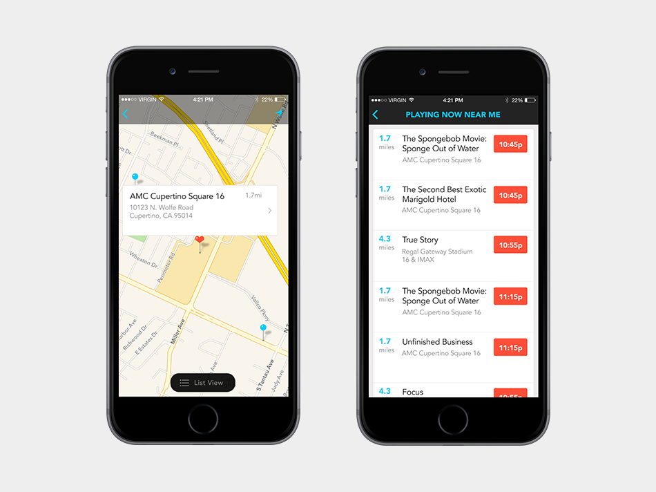
Search
Implemented native search to provide a better experience that matched the overall look of the application. The previous app had been tying into a webview-based search that created inconsistencies in look and behavior.
Added quick search and search within multiple criterias in order to allow for faster findability of app content.
Creative Team
Suzanne Elizondo - Creative Director
Dan Tran - Lead UX Designer (Concept, iOS Wireframes, Overall Visual Design)
Tina Hernandez - UX Designer (Android Wireframes)